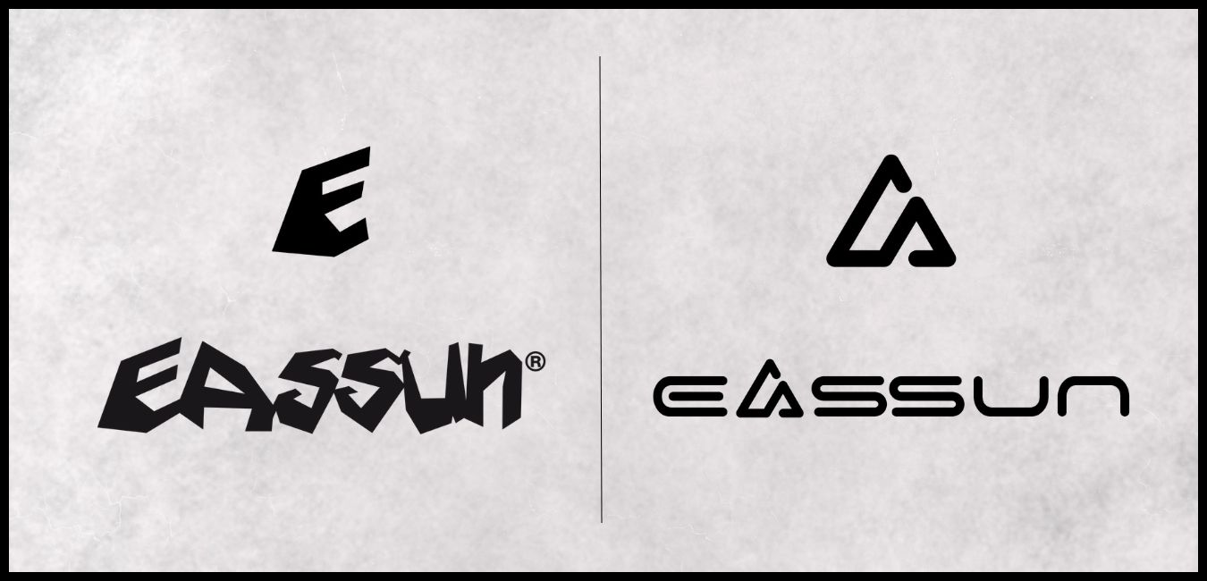
After more than 30 years of activity under the presence of our initial logo, EASSUN has decided to renew it with a new one. This innovative step in the brand's corporate image is based on the modernization of its design, conveying the dynamism and exclusivity, both characteristic traits of the brand.
Additionally, the brand will also modify its representative symbol, which consists of the initial 'E' from the logo, replacing it with a novel drawing corresponding to the incorporated 'A.' This way, a dual meaning is expressed, referring to the shape of a mountain and the aforementioned letter. This change emphasizes the brand's passion for nature-related sports through a striking design adapted to the latest current style trends.
Throughout the year 2024, EASSUN will be integrating the new logo and gradually replacing it in all product lines corresponding to its cycling, running, and skiing collections, excluding prescription models, which will retain the original logo.


Comments (0)